Why So Many New Websites Look Exactly the Same
12th July 2026
Every so often, while browsing the websites of local businesses, you come across one that feels strangely familiar. It might belong to a plumber, a car finance company, a cleaning firm or a gym, and yet you’d swear you’ve seen it somewhere before.
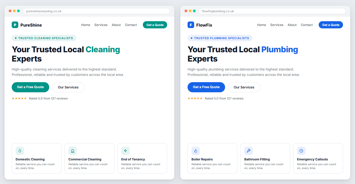
The same little coloured label sitting above every heading. The same rounded white cards on a pale grey background. The same tiny line icons in softly tinted squares. The same list of town names in little rounded capsules. Swap the logo and change the accent colour, and the website could belong to almost any business in almost any industry.
Now, most websites don’t look like this, far from it. But a growing number of newly launched ones do, and once you’ve spotted the pattern, you can’t stop seeing it. It’s the recognisable look of AI-led web design. And here’s the interesting part, the real subject of this article: the pattern doesn’t actually tell you that a website was made by AI. It tells you something more useful than that. It tells you that nobody edited it.
Where the “AI website look” comes from
Over the past couple of years, AI website builders and design tools have become remarkably capable. Describe a business in a sentence or two and, within minutes, you’ll get a complete, professional-looking website: hero section, services, reviews, FAQs, contact form, the lot.
We should say up front: we use AI tools every day at Get Noticed Locally. They’re a genuinely useful part of modern web design, and we’re not going to pretend otherwise. In fact, it’s precisely because we use them so much that we know their habits so well.
And they do have habits. These tools learned what websites look like by studying enormous numbers of existing websites, so when asked to design one, they reach for the patterns they’ve seen most often. Every tool, trained on broadly the same internet, reaches for broadly the same patterns. Ask one for a roofing website, a dental website or an accountancy website and the first draft will be built from the same familiar kit of parts.
To be clear, that first draft is often genuinely good. It’s clean, it’s tidy, it works on mobile, and for some businesses it would function perfectly well. The parts themselves aren’t the problem. They’re sensible, proven design conventions, and skilled human designers use many of them deliberately.
The problem is what it means when the complete, unaltered set appears on a finished website: it means the first draft is what went live.
How to spot a first draft that went live
Here are the defaults we see over and over again. Remember the rule as you read: any one or two of these means nothing at all. It’s the full formula, top to bottom, that tells the story.
- The eyebrow label. A tiny piece of uppercase text above every main heading, often inside a small rounded “pill” with a dot beside it. OUR SERVICES. WHY CHOOSE US. TESTIMONIALS. It’s the default way these tools introduce a section, and left unedited, they’ll introduce every section this way.
- Cards for everything. Services in rounded white cards. Benefits in rounded white cards. Reviews, FAQs, contact details and partner logos: all in rounded white cards with identical padding, floating on a pale grey or cream background. The card is the tool’s answer to every design question it hasn’t been asked to think harder about.
- Icons in tinted squares. Small line-drawn icons inside softly coloured rounded squares, one per card, perfectly evenly spaced. Attractive, and exactly the same for a roofer, a solicitor and a software company.
- The one highlighted word. A large headline with a single word picked out in the brand colour. A perfectly good technique, which is why the tools apply it to virtually every hero section they generate.
- Location capsules. Town and city names presented as a row of little rounded tags. If you’ve looked at a few local trade websites recently, you’ve almost certainly seen this exact component more than once.
- The identikit contact section. An icon, an uppercase label (PHONE. EMAIL. ADDRESS.) and the detail underneath, repeated three or four times in a neat row.
- The gradient CTA strip. A full-width coloured band near the bottom of the page: short question, one line of supporting text, two rounded buttons.
Now, the important bit. Seeing a couple of these on a website proves nothing. They’re standard components, and we use some of them ourselves when they’re the right choice for the job. What the complete formula reveals is an absence: no sign that anyone looked at the generated draft and asked whether this section suits this business, whether that heading says anything real, or whether the page should be structured differently for these particular customers. The tool made every decision, because nobody else did.
Why an unedited website costs you more than it saves
It would be easy to shrug and say: so what? If the site looks professional, does it matter how it got there?
We’d argue it matters a great deal, for three reasons.
- Distinctiveness is the job. Your website usually gets one chance to make an impression, and most of your potential customers are comparing you against two or three competitors in another tab. If your site and theirs were assembled from the same kit, possibly by the very same tool, you’ve surrendered the easiest opportunity you had to look different. The businesses that win online are memorable. Interchangeable websites, by definition, aren’t.
- An unedited design usually means unexamined thinking. The visual sameness is a symptom of something deeper. A website generated in minutes hasn’t been shaped by anyone asking which of your services makes you the most money, why customers choose you over the firm down the road, or what evidence would convince a sceptical visitor to pick up the phone. So the template gets filled with plausible-sounding phrases: “trusted specialists”, “highest standards”, “experience and reliability”. Copy that could describe any business in your industry, because it wasn’t written about yours.
- Your customers can feel it, even if they can’t name it. Most visitors will never consciously notice an eyebrow pill or an icon square. But people are surprisingly good at sensing when something is generic: when the words say nothing in particular and the design has no personality behind it. That vague feeling of “this could be anyone” quietly undermines the trust your website exists to build.
The difference isn’t AI. It’s decisions.
So is the answer to avoid AI in web design? No, and we’d be hypocrites to suggest it, because AI plays a real part in our approach to every project.
We use it to explore creative directions we might not otherwise have considered, to compare layout ideas quickly, and to help develop and refine written content. It lets us put more options on the table for every project than would have been practical a few years ago. Used this way, AI makes the finished website better.
The difference is what happens next. At every stage after that, a person makes the decisions.
Before any design work begins, we learn about the actual business: what it does, who its customers are, what makes it different, and what the website needs to achieve. Our designers then treat everything AI produces as raw material, keeping what suits the business, rejecting what’s generic, and creating the final design properly in Figma. That approved design is built by our team in WordPress, refined by hand across desktop, tablet and mobile, and filled with content written about the real business, its real work and its real customers. And because it’s built on an established content management system, it can be updated, expanded and supported for years after launch as the business grows.
Every website we produce is individually designed around the business it belongs to. That, to us, is what bespoke actually means. Not avoiding modern tools, but never letting an automated tool make the important decisions.
Put simply: an AI tool can design a website for a cleaning company. Our job is to design the website for that cleaning company. The first is a polished first draft. The second is a website only one business could own.
Standing out is the whole point
Our company is called Get Noticed Locally for a reason. A website that looks like every other website in your industry doesn’t get noticed, however clean and modern it appears at first glance.
The technology behind web design will keep improving, and we’ll keep using the best of it. AI will make professional-looking websites easier and easier to produce. Human involvement is what stops professional-looking from becoming interchangeable, and that part of the job isn’t going anywhere: understanding a business properly, making deliberate decisions on its behalf, and building something its competitors couldn’t simply generate.
If you’d like a website designed around your business rather than assembled from the usual kit of parts, take a look at our recent work or get in touch for a free, no-obligation quote. And if you’re simply wondering whether your current website is an unedited first draft, send us the link. We’ll give you an honest answer. We always do.